VerStyle Studio: Mens Local Barber Shop

Rebrand Project: Local Barber Shop
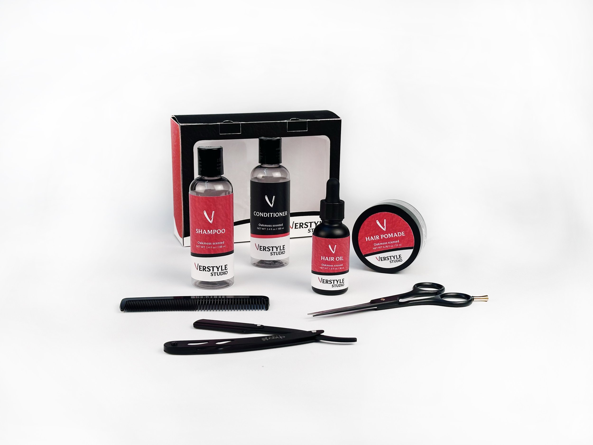
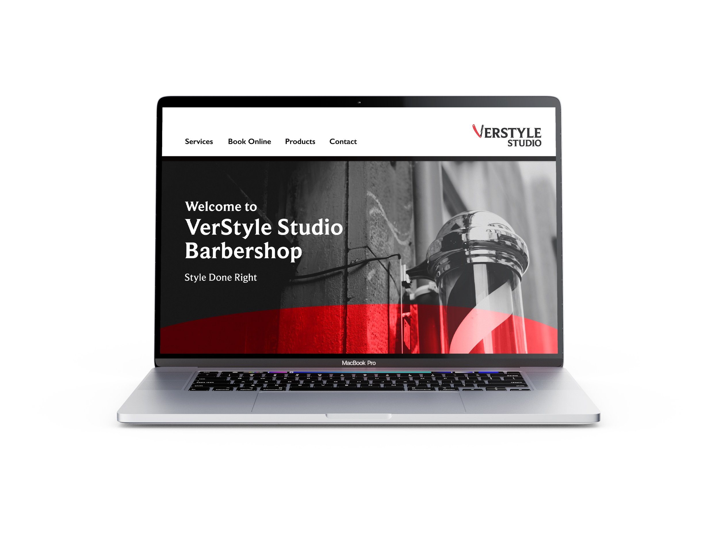
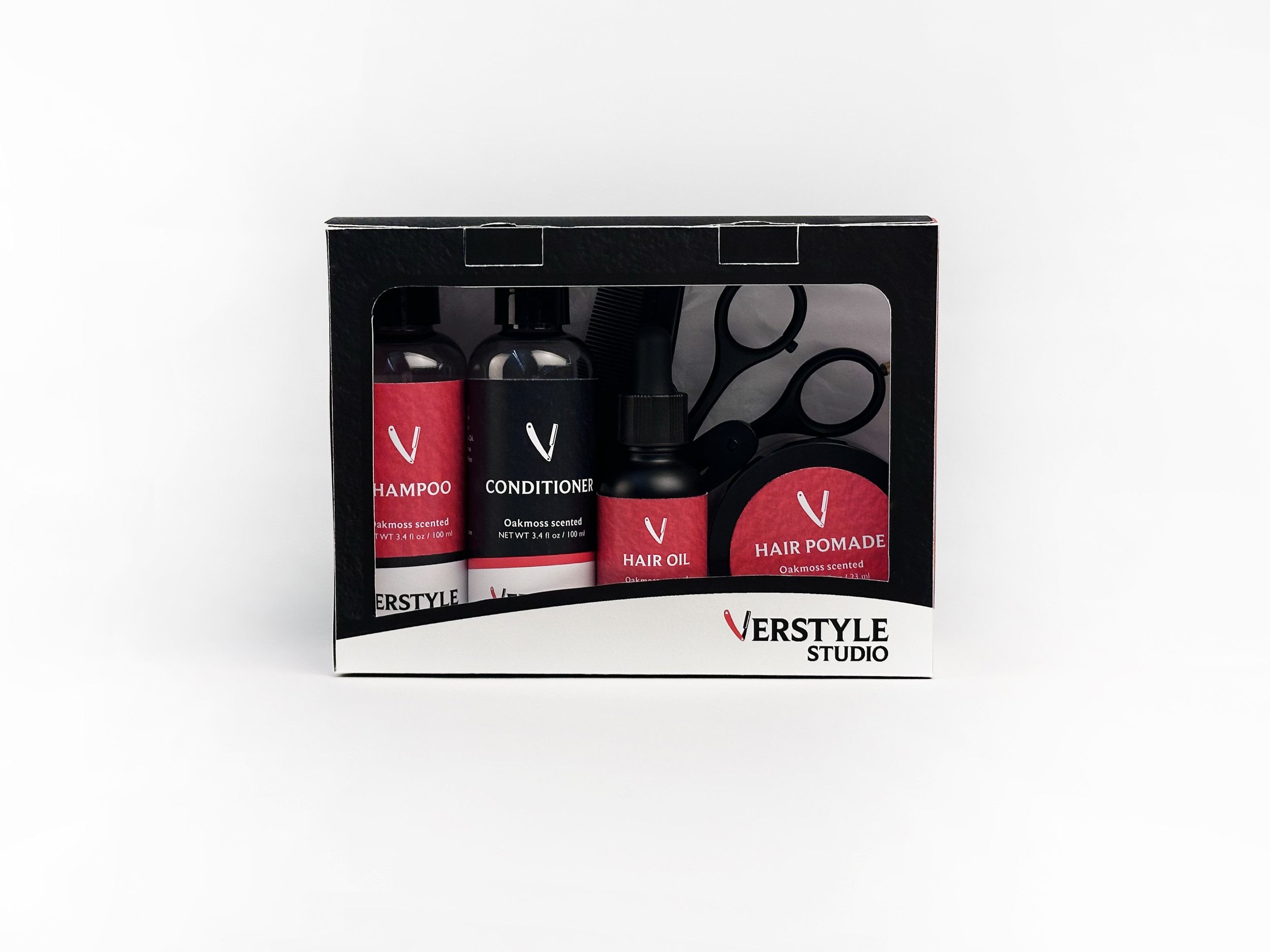
The goal for this project was to rebrand a local barbershop in Grand Rapids called VerStyle Studio. The rebrand consists of new logo branding and campaign directions including an updated website and new packaging.
Illustrator | Photoshop | Figma

Updated Website


Packaging Mini Hair Care Kit
Check out my thought process behind this rebrand and how it could be executed to the client through the brand style guide!
Original Logos


2022
2023
The original logos are contained in a circular shape with various iconographic elements such as a razor, scissors, barber pole, and a stylized “S” to represent hair. The new eddition of a bold simple red, black, and white color palette inspired the new brand logo.

New Logo and Logo Mark

This simplified new logo and logo mark introduce a new flexibility for VerStyle Studios’ brand. It includes similar elements from the original logos such as the serif font, bold stacked words, bold colors, and stylized letter “V” that also embodies a hand razor.


Primary Palette
VerStyle White
Studio Black
Hex #ffffff
Hex #070404
Barbershop Red
Hex #e81e25
Typography


